This project aims to predict the resale prices of BMW cars, based on historical data. I did this project as part of my Datacamp certification.
Slides for a presentation with a non-technical target audience can be seen here . The source for this project is available on github . The model developed in the project is deployed to Heroku, and can be queried using the following form (note that not all fields need to be filled out, and that it may take more than 10 seconds for the first response to appear, although subsequent responses will be faster)
In the rest of the blog post follows a detailed report intended for a technical audience, who already has some familiarity with machine learning methods.
Motivation
Cars are used by people through the world. Buying a new car is for many a big investment, and cars last for many years, so there is a big market for reselling cars. Many people who want to sell a car, especially a car that they have owned for a number of years, might not have a clear idea about the current value of the car, and therefore no frame of reference for negotiating a selling price with a car dealer. Similarly would most people who are buying a new car probably not know what the typical prices for the cars they are looking at are, and if the prices they are seeing at the car dealership are reasonable or not.
The purpose of this project is to build a model for predicting the resale prices of cars. This model can be then be used by consumers who are looking to sell or buy a car, similar to the way for instance Kelley Blue Book works.
Since the available data is for BMW cars, the model will only target this car brand.
The data
The data this analysis will be based on was provided by Datacamp from this github repository . From the readme of the dataset (available here ), one can see that the dataset contains information about price, transmission, mileage, fuel type, road tax, miles per gallon (mpg), and engine size. Upon inspection of the dataset (see below), it turned out to additionally contain the car model and year (I’m assuming this means production year). The table below shows the features in the data. The units of the data was not specified, so for the current analysis I will assume imperial units.
| Feature | Description | Type |
|---|---|---|
| model | Car model | categorical |
| year | Production year | numerical |
| transmission | Type of transmission | categorical |
| mileage | Distance driven in miles | numerical |
| fuelType | Fuel type | categorical |
| tax | Road tax | numerical |
| mpg | Miles per gallon | numerical |
| engineSize | Size of engine | numerical |
The target variable for this analysis is the price, which I will assume is in US dollars. Since this is a continuous numerical variable, the analysis I will be making is a regression analysis.
Analysis plan
This problem is a regression problem as mentioned above. My plan for approaching this problem will follow these steps
-
List the performance metrics that could be relevant for this analysis
-
Think about my a priori expected relationships between the features in the data
-
Explore the data to see relationships between features, and look at and mitigate any potential data quality issues
-
Select an appropriate model, fit it to the data, and validate its results
-
Discuss the strengths and weaknesses of the model, and options for next steps
Performance metrics
For a regression problem, unlike for a classification problem, there is no definite “yes or no” sense of whether a given prediction is correct or wrong. Rather, the “goodness” of a prediction can be judged by the distance between a prediction and the corresponding observation.
Mean squared error (MSE)
Typically this distance is taken based on the Euclidean distance. The mean squared error is the average of the square of the distance between each prediction and the corresponding observation. This is typically the measure which is minimized in the fitting of e.g. a linear regression model.
It is an absolute measure, meaning that its value will depend on the absolute size of the target variable. Because of this, knowing the MSE for a single model will not tell you much about how well the model performs, although comparing MSE between different models can be useful in seeing which one performs the best.
R-squared (R^2) coefficient of determination
The R^2 coefficient is a measure of how much of the variance of the target variable is predictable by the independent variables. It is a relative measure, meaning that its value do not depend on the absolute values of the target variable. It can only be less than or equal to 1. The closer it is to 1, the better the quality of the fit. This is the most commonly used metric for regression problems.
Adjusted R^2 coefficient
The adjusted R^2 coefficient is often used for feature selection, since it penalizes adding more features to a model. This adjusts for the fact that the normal R^2 coefficient tends to increase when features are added, even in cases where this does not improve the accuracy of the model. It is given as (see Wikipedia )
\[\bar{R}^2 = 1 - (1-R^2)\frac{n-1}{n-p-1}\]
where \(R^2\) is the usual R^2 coefficient, \(\bar{R}^2\) is the adjusted one, \(n\) is the number of samples and \(p\) is the number of features.
When the number of samples is much larger than the number of features we have that \[\bar{R}^2 = R^2 - (1-R^2)\frac{p}{n-1} + O((p/n)^2)\] so the adjusted R^2 will be very close to the usual R^2 coefficient.
A priori expectation
Here I want to describe my initial expectations for the relationships between the features of the data, and formulate different feature selection models.
The five features model, year, transmission, fuel type, and engine size collectively describe the car configuration at the time of initial purchase. The feature mileage describes how much the car has been used, and therefore worn since that point. The features miles per gallon and road tax should in principle be inferable based on the new car configuration quantities.
I suspect that the price will strongly depend on the mileage and age of the car, and a first simple model could therefore just consider these two variables.
# The code in this section requires the file draw_diagrams.py to be in the same directory as this notebook
# It also requires graphviz to be installed. Not just the python package, but the full program
import draw_diagrams
draw_diagrams.data_model1()

An improvement on this would be to include the new car configuration variables. From these in addition to price, mpg and road tax could in principle be inferred, although in the following analysis I will focus on the price.
draw_diagrams.data_model2()

Finally the last two variables, mpg and road tax, can be included as features. These could affect the resale price of the car, since they might influence how much a buyer is willing to pay, but I suspect this connection will be less strong than the connection between the other variables and price.
draw_diagrams.data_model3()

Before any of this though, first I want to take a closer look at the data.
Data exploration
Loading and inspecting data
First I load and inspect the data. I downloaded the data from here
and saved it in the datasets/bmw.csv file.
import numpy as np
import pandas as pd
# The code in this cell makes dataframes render as markdown tables in markdown output
def _repr_markdown_(self):
    return  self.to_markdown()
# The code in this cell makes dataframes render as latex tables in latex output
def _repr_latex_(self):
    return  "{{\centering{%s} }}" % self.to_latex()

from IPython import get_ipython
ip = get_ipython()
if ip:
    markdown_formatter = ip.display_formatter.formatters["text/markdown"]
    markdown_formatter.for_type(pd.DataFrame, _repr_markdown_)
    markdown_formatter = ip.display_formatter.formatters["text/latex"]
    markdown_formatter.for_type(pd.DataFrame, _repr_latex_)

# pd.DataFrame._repr_markdown_ = _repr_markdown_  # monkey patch pandas DataFrame
bmw = pd.read_csv("datasets/bmw.csv")
bmw.head()
| model | year | price | transmission | mileage | fuelType | tax | mpg | engineSize | |
|---|---|---|---|---|---|---|---|---|---|
| 0 | 5 Series | 2014 | 11200 | Automatic | 67068 | Diesel | 125 | 57.6 | 2 |
| 1 | 6 Series | 2018 | 27000 | Automatic | 14827 | Petrol | 145 | 42.8 | 2 |
| 2 | 5 Series | 2016 | 16000 | Automatic | 62794 | Diesel | 160 | 51.4 | 3 |
| 3 | 1 Series | 2017 | 12750 | Automatic | 26676 | Diesel | 145 | 72.4 | 1.5 |
| 4 | 7 Series | 2014 | 14500 | Automatic | 39554 | Diesel | 160 | 50.4 | 3 |
No obvious problems from looking at the first few entries. Let’s check the datatypes, and see if there are any missing values.
bmw.info()
<class 'pandas.core.frame.DataFrame'>
RangeIndex: 10781 entries, 0 to 10780
Data columns (total 9 columns):
 #   Column        Non-Null Count  Dtype
---  ------        --------------  -----
 0   model         10781 non-null  object
 1   year          10781 non-null  int64
 2   price         10781 non-null  int64
 3   transmission  10781 non-null  object
 4   mileage       10781 non-null  int64
 5   fuelType      10781 non-null  object
 6   tax           10781 non-null  int64
 7   mpg           10781 non-null  float64
 8   engineSize    10781 non-null  float64
dtypes: float64(2), int64(4), object(3)
memory usage: 758.2+ KB
There are no missing values, since all columns have 10781 non-null entries, and this matches the length of the DataFrame. I also see that there are three columns with object data type, which are the categorical columns. The remaining columns are numerical.
Next I take a look at the categories in the categorical variables
for col in ["model", "fuelType", "transmission"]:
    unique = list(bmw[col].unique())
    print(f"{col} has {len(unique)} unique values:" )
    print(unique)
model has 24 unique values:
[' 5 Series', ' 6 Series', ' 1 Series', ' 7 Series', ' 2 Series', ' 4 Series', ' X3', ' 3 Series', ' X5', ' X4', ' i3', ' X1', ' M4', ' X2', ' X6', ' 8 Series', ' Z4', ' X7', ' M5', ' i8', ' M2', ' M3', ' M6', ' Z3']
fuelType has 5 unique values:
['Diesel', 'Petrol', 'Other', 'Hybrid', 'Electric']
transmission has 3 unique values:
['Automatic', 'Manual', 'Semi-Auto']
Here I see that there are a lot of different car models represented in the dataset.
Finally I take a look at the numerical variables:
bmw.describe()
| year | price | mileage | tax | mpg | engineSize | |
|---|---|---|---|---|---|---|
| count | 10781 | 10781 | 10781 | 10781 | 10781 | 10781 |
| mean | 2017.08 | 22733.4 | 25497 | 131.702 | 56.399 | 2.16777 |
| std | 2.34904 | 11415.5 | 25143.2 | 61.5108 | 31.337 | 0.552054 |
| min | 1996 | 1200 | 1 | 0 | 5.5 | 0 |
| 25% | 2016 | 14950 | 5529 | 135 | 45.6 | 2 |
| 50% | 2017 | 20462 | 18347 | 145 | 53.3 | 2 |
| 75% | 2019 | 27940 | 38206 | 145 | 62.8 | 2 |
| max | 2020 | 123456 | 214000 | 580 | 470.8 | 6.6 |
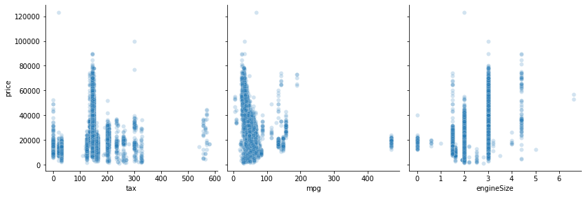
The dataset has cars from 2020 going all the way back to 1996, although the mean is around 2017, and the 25% quantile is 2016, so most of the cars in the dataset are quite new. This is also reflected in the mileage, where the mean and median are both around 20,000 miles, but the most extreme value is beyond 200,000 miles. Prices range all the way beyond \$100,000, although most of the prices seems to be around \$20,000. mpg has mean and median around 50 mpg, but there appears to be some larger values up to 470 mpg. The road tax and engine size columns both have values of 0, which seems weird for those quantities. This is likely due to wrong or missing data, which I will treat later.
Data visualization
import matplotlib.pyplot as plt
import seaborn as sns
Continuous variables
Let’s look at how the price depends on all the continous variables using a pair plot. To make the plots easier larger and easier to read, I split them across two rows
def split_pairplot(data, x_vars, **kwargs):
    len_x = len(x_vars)
    for x_vars_ in (x_vars[: len_x // 2], x_vars[len_x // 2 :]):
        sns.pairplot(data, x_vars=x_vars_, **kwargs)


split_pairplot(
    bmw,
    x_vars=["price", "year", "mileage", "tax", "mpg", "engineSize"],
    y_vars=["price"],
    height=4.0,
    aspect=1,
    plot_kws={"alpha": 0.2},
)
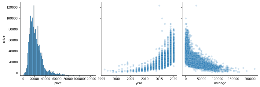
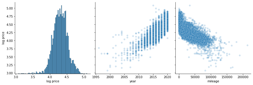
There definitely appears to be a relationship between price and both mileage and year. The relationship looks like it might be exponential, so let’s look at the logarithm of the price
bmw_log = bmw.copy()
bmw_log["log price"] = np.log10(bmw_log["price"])
bmw_log = bmw_log.drop("price", axis="columns")

split_pairplot(
    bmw_log,
    x_vars=["log price", "year", "mileage", "tax", "mpg", "engineSize"],
    y_vars=["log price"],
    height=4.0,
    aspect=1,
    plot_kws={"alpha": 0.2},
)
Overplotting is a problem in the above scatter plots, due to the large number of data points. Even with alpha=0.2, the distribution in areas with many points cannot be seen due to all the point overlapping there. Below I make a KDE plot to show the distribution in the places where many points are clustered. Note that computing the KDE for this many points takes a little time (around 1 minute on my machine).
%%time
split_pairplot(
    bmw_log,
    x_vars=["log price", "year", "mileage", "tax", "mpg", "engineSize"],
    y_vars=["log price"],
    kind="kde",
    height=4.0,
    plot_kws={"fill": True},
)
CPU times: user 1min 7s, sys: 685 ms, total: 1min 7s
Wall time: 1min 6s
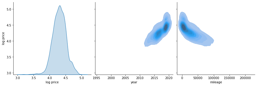
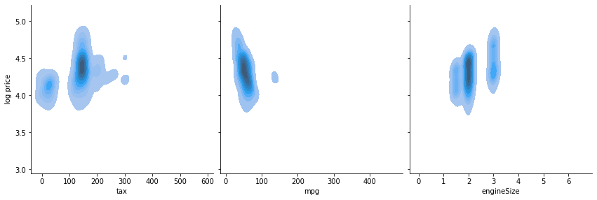
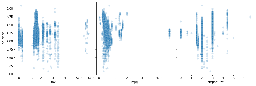
These plots reveal that there appears to be a linear relationship between the logarithm of the price, and both year and mileage. Also, the KDE plot shows that there might be a weak linear relationship between engine size and log price, which was less visible in the scatter plot. There is no obvious relationship between the price and the remaining variables, whether we consider its logarithm or not. Based on these plots, going forward in the analysis, I will be using the logarithm of the price as the target variable.
Categorical variables
Let’s also take a look at how the price depends on the categorical variables. Below here I plot violin and count plots for how the logarithm of the price depends on fuelType and transmission. From the count plot I can see how many cars are in each category, and the violin plot shows the distribution over prices within each category. Notice that the violin plots are scaled to have the same width (so the width does not reflect the number of cars in the given category, the plot only shows the distribution).
def plot_violin_and_count(x, y, data, axes):
    sns.violinplot(x=x, y=y, data=data, ax=axes[0], scale="width")
    g = sns.countplot(x=x, data=data, ax=axes[1])
    return g


fig, axes = plt.subplots(2, 2, figsize=[15, 8])

plot_violin_and_count(y="log price", x="fuelType", data=bmw_log, axes=axes[:, 0])
plot_violin_and_count(y="log price", x="transmission", data=bmw_log, axes=axes[:, 1])
<AxesSubplot:xlabel='transmission', ylabel='count'>
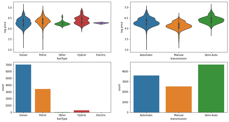
From these plots I see that there are many diesel and petrol cars, only few hybrid cars, and very few electric and “other” cars. The low number of electric and “other” cars means that it could be difficult to make good predictions for these types of cars, more about this later in the data cleaning section. The distribution of prices over the different fuel types appears to be fairly regular and somewhat close to normal distributions, even though the hybrid cars shows a double peak structure. The mean of the distributions all appear to be fairly close, which would make it difficult for a linear model to distinguish these categories.
The counts in the transmission categories appears more evenly distributed than for the fuel type categories. From the distributions it appears that manual transmission cars are generally a bit cheaper than the other two types, and that semi-auto cars are generally a bit more expensive than automatic ones, all of which seems quite reasonable.
Lastly, I plot the model category by itself since it contains many (20+) categories. Before plotting I sort according to the number of cars of each model.
model_count = bmw_log.groupby("model")["model"].count()
model_count.name = "model count"
bmw_sorted_model_count = (
    bmw_log.merge(model_count, on="model")
    .sort_values("model count", ascending=False)
    .drop("model count", axis="columns")
)
g = sns.catplot(x="model", y="log price", data=bmw_sorted_model_count, kind="violin", aspect=2.3, scale='width')
g.set_xticklabels(rotation=90)
g = sns.catplot(x="model", data=bmw_sorted_model_count, kind="count", aspect=2.3)
g.set_xticklabels(rotation=90)
<seaborn.axisgrid.FacetGrid at 0x7f59053b7b20>
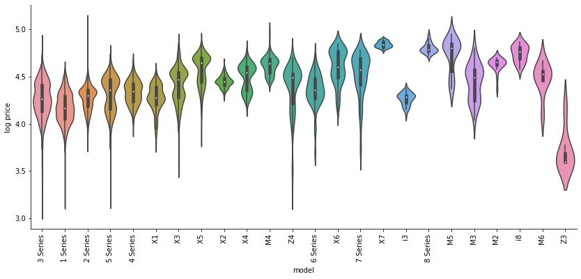
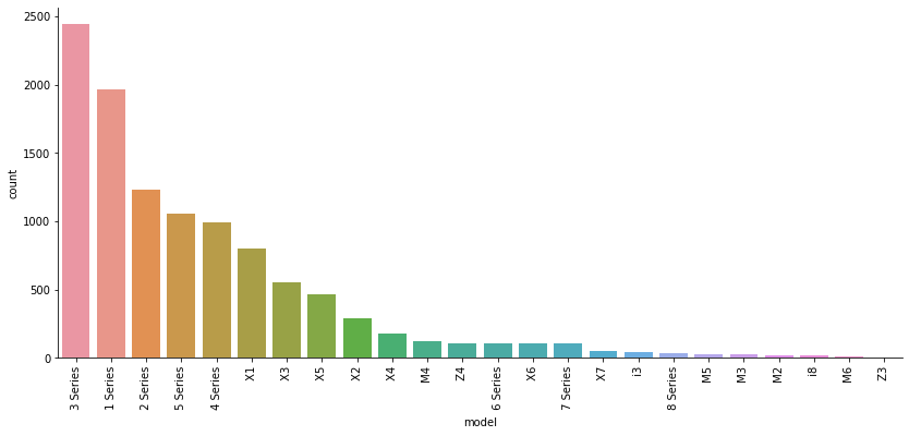
The Series 1-5 and to a lesser extent the X 1-4 models have many records, while the remaining car models have few to very few records. The distribution of most of the models show a one- or two-peak structure, with various mean values, which should make it possible for a linear model to somewhat distinguish between them.
Data cleaning
Continuous variables
From the plots we can see that mpg has a group of values near 400, far from the nearest values which are less than 200. Let’s see how many different values are present there
mpg_400_plus = bmw_log[bmw_log["mpg"]>400]["mpg"]
print(mpg_400_plus.unique())
print(mpg_400_plus.count())
[470.8]
43
All the 43 values of mpg in the group near 400 are the same. This looks very suspicious. I suspect this is data is wrong, perhaps due to some mistake in the data collection, or perhaps the value 470.8 was used as a placeholder for missing data. Ideally I would like to follow up with the data collection team on this. At any rate, these values could seriously skew a model since they are so high compared to the other values. I should eliminate these values, either by imputing with e.g. average, or by dropping the records all together.
Previously I noted that tax and engineSize contained zero values, which seemed strange. Let’s take a look at how many of such values are present
def print_count_equals(df, col, val):
    count = (bmw_log[col] == val).sum()
    print("{} contains {} elements with value {}".format(col, count, val))


print_count_equals(bmw_log, "tax", 0)
print_count_equals(bmw_log, "engineSize", 0)
tax contains 340 elements with value 0
engineSize contains 47 elements with value 0
The skewing effect of these is probably less then for the mpg outliers, since zero is closer to other values of tax and engine size, but I should still either impute or drop these records.
There are around 500 suspicious records in tax, engineSize and mpg, which is roughly 5% of the total number of records (around 10,000). Since there are many records in the dataset and this is a fairly small part of the dataset, I choose to drop all the affected records. Alternatively I could have imputed these records, by replacing them with e.g. the average or median of the remaining records.
to_be_dropped = (bmw_log.mpg > 400) | (bmw_log.engineSize == 0) | (bmw_log.tax == 0)
bmw_dropped = bmw_log[~to_be_dropped]
Categorical variables
Let’s take a closer look at the categorical columns. In the plots previously I saw that some of the categories have very few values. Below I print the number of records in each category.
categorical_columns = ["model", "fuelType", "transmission"]


def print_categorical_counts(df, columns):
    for col in columns:
        display(df.groupby(col)[col].count().sort_values().to_frame(name="count"))


print_categorical_counts(bmw_dropped, categorical_columns)
| model | count |
|---|---|
| Z3 | 7 |
| M6 | 8 |
| i8 | 10 |
| M2 | 21 |
| M3 | 27 |
| M5 | 29 |
| 8 Series | 39 |
| X7 | 55 |
| 7 Series | 105 |
| X6 | 106 |
| Z4 | 108 |
| 6 Series | 108 |
| M4 | 125 |
| X4 | 179 |
| X2 | 288 |
| X5 | 450 |
| X3 | 551 |
| X1 | 804 |
| 4 Series | 995 |
| 5 Series | 1056 |
| 2 Series | 1203 |
| 1 Series | 1800 |
| 3 Series | 2343 |
| fuelType | count |
|---|---|
| Other | 13 |
| Hybrid | 166 |
| Petrol | 3414 |
| Diesel | 6824 |
| transmission | count |
|---|---|
| Manual | 2359 |
| Automatic | 3428 |
| Semi-Auto | 4630 |
There are a number of categories with very few records. For instance, the Z3 model has only seven. With such a small amount of observations for this category, and no obvious relationship with other entries in this category as one naturally has for numeric columns, I wouldn’t expect it to be possible to make reliable predictions for the selling price for this category. I therefore choose to drop any category with less than 20 records1.
By the way, notice how the electric fuel type is not present here. It appears that it was dropped when I did data cleaning on the continuous variables before.
def drop_almost_empty_categories(df, col, nmin=20):
    category_count = df.groupby(col)[col].count()
    for category_name, count in category_count.iteritems():
        if count < nmin:
            print(f"Dropping {category_name} in {col}")
            df = df[df[col] != category_name]
    return df


bmw_cat = bmw_dropped.copy()
for col in categorical_columns:
    bmw_cat = drop_almost_empty_categories(bmw_cat, col)
bmw_cat[categorical_columns] = bmw_cat[categorical_columns].astype("category")
Dropping  M6 in model
Dropping  Z3 in model
Dropping  i8 in model
Dropping Other in fuelType
Predictability of mpg and tax (side note)
As a side note, intuitively I expected that miles per gallon and road tax could be predicted from the new car configuration. Looking closer at the data though (using the code at the beginning of the next code block, which I commented out here since it produces very long output), it became clear that for many of the new car configurations, a number of different mpg and tax are attached. A specific example is shown below:
# new_car_cols = ['model', 'transmission', 'fuelType', 'engineSize', 'year']
# with pd.option_context("display.max_rows", None):
#     new_car_grouped = bmw.groupby(new_car_cols)[["tax", "mpg", "price"]]
#     display(new_car_grouped.nunique())
choices = (
    (bmw.model == " 1 Series")
    & (bmw.transmission == "Automatic")
    & (bmw.fuelType == "Diesel")
    & (bmw.engineSize == 2.0)
    & (bmw.year == 2016)
)
print("mpg values:", sorted(bmw[choices]["mpg"].unique()))
print("tax values:", sorted(bmw[choices]["tax"].unique()))
mpg values: [60.1, 62.8, 65.7, 67.3, 68.9, 70.6, 74.3]
tax values: [0, 20, 30, 125]
Since it does not seem possible to simply associate a single value of mpg and tax to each configuration, predicting these values would not be straightforward. This might also indicate problems with the accuracy of the data in the mpg and tax columns. Anyways, the main focus here is on predicting price, so end side note.
Regression models
In the initial data analysis I saw that the relationship between the logarithm of the price and both year and mileage appears to be linear, so in this section I will train linear models on the data. I will use the R^2 score to perform feature selection, evaluate whether overfitting is taking place, and to evaluate overall performance of the models.
First I import the needed libraries, and define a couple of utility functions that will be useful later
from sklearn.compose import make_column_transformer, make_column_selector
from sklearn.linear_model import LinearRegression
from sklearn.metrics import r2_score
from sklearn.model_selection import train_test_split
from sklearn.model_selection import cross_validate
from sklearn.pipeline import Pipeline
from sklearn.preprocessing import OneHotEncoder


def every_column_name_but(df, dependent):
    features = [col for col in df.columns if col != dependent]
    return features


def split_dependent(df, dependent="log price"):
    features = every_column_name_but(df, dependent)
    return df[features], df[dependent]
I hold out 20% percent of the data for validation before training any model
bmw_train, bmw_val = train_test_split(bmw_cat, test_size=0.2, random_state=42)
I will use one hot encoding to deal with the categorical variables in the data. The linear regression is only able to deal with numerical variables, so in order to treat categorical variables where there is no numerical relation between the categories, one hot encoding creates new features for every category, where the value in each of the new features is one for records with that category, but zero otherwise. Below I build a pipeline that applies one hot encoding to all categorical variables in the dataset, before passing the data on to a linear regressor.
def make_cat_ohe(drop="first"):
    """Make a one hot encoder that only acts on categorical columns"""
    cat_transformer_tuple = (
        OneHotEncoder(drop=drop),
        make_column_selector(dtype_include="category"),
    )
    ohe = make_column_transformer(cat_transformer_tuple, remainder="passthrough")
    return ohe


def make_ohe_linreg(drop="first"):
    linreg = Pipeline(
        (("one_hot", make_cat_ohe(drop=drop)), ("regressor", LinearRegression()))
    )
    return linreg


linreg = make_ohe_linreg()
Feature selection
As a start, I test this model with the first data model, including only mileage and year as features, with cross validation. This splits the data into five blocks, trains on the first four blocks combined and tests against the last block. This is repeated 4 times, where each time a new block is used for testing, and the remaining blocks are used for training. This helps check that the score is not artificially high or low due to some particular test/train split.
X, y = split_dependent(
    bmw_train[["log price", "mileage", "year"]], dependent="log price"
)
scores = cross_validate(linreg, X, y, return_train_score=True)
pd.DataFrame(scores)[["test_score", "train_score"]].T
| 0 | 1 | 2 | 3 | 4 | |
|---|---|---|---|---|---|
| test_score | 0.643967 | 0.638558 | 0.653213 | 0.666797 | 0.612777 |
| train_score | 0.643327 | 0.644624 | 0.641166 | 0.637258 | 0.651418 |
The R^2 values from the cross validation are fairly consistent across the cross validation folds, but has quite small values around 0.65 (the closer to 1, the better), indicating that this is not a very accurate fit.
I also make a residuals vs fitted plot. The residuals are the difference between the observed and fitted values of the target variable \(y_i - \hat{y}_i\). An assumption underlying linear regression is that these residuals are normally and randomly distributed, and this is what I want to check with the residuals vs fitted plot, where the residuals are plotted against the fitted values of the target variable (log price in this case). If this plot shows a random distribution it indicates the linear model is okay, but if any systematic pattern appears, it indicates a problem.
def plot_residuals(X, y, linreg):
    linreg.fit(X, y)
    y_pred = linreg.predict(X)
    resid = y - y_pred
    g = sns.jointplot(x=y_pred, y=resid, kind="scatter", joint_kws=dict(alpha=0.2))
    g.plot_joint(sns.kdeplot, color="r")
    g.ax_joint.set_xlabel(y.name + " (fitted)")
    g.ax_joint.set_ylabel("Residuals")
    plt.show()


plot_residuals(X, y, linreg)
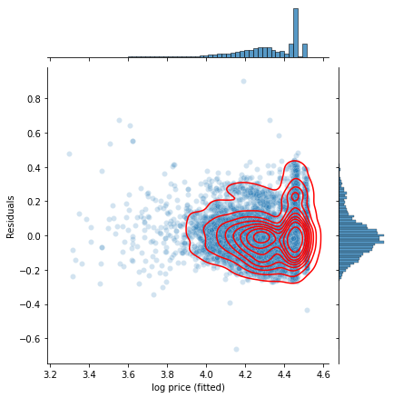
Here I was facing the same overplotting problem as previously in the scatter plot, so I overlayed a KDE plot to show the distribution in the high density region. I see that the residuals vs fitted plot shows a largely random, normal distribution, although the residuals have a raised tail towards positive values, and the distribution of fitted log price looks quite different from the plots of the log price observations I saw in the EDA section. This indicates that the model underestimates the price of a significant group of cars, most likely the more expensive car models, since the linear model is not differentiating across car models here. This together with the low R^2 value indicates that this model is not very accurate.
I therefore continue and include more features. To get a feeling for which features are important, I will add features one by one, and then compare the cross validation scores of the resulting models.
def scores_mean_and_std(scores):
    """Finds mean and standard deviations of scores from `cross_validate`,
    and puts them in a dataframe."""
    scores = pd.DataFrame(scores)[["test_score", "train_score"]]
    mean = scores.mean().add_prefix("mean_")
    std = scores.std().add_prefix("std_")
    mean_std = pd.concat((mean, std))
    return mean_std


feature_cols = [
    "mileage",
    "year",
    "model",
#    "year",
    "engineSize",
    "transmission",
    "fuelType",
    "mpg",
    "tax",
]
linreg = make_ohe_linreg()
all_scores = {}
for i in range(1, len(feature_cols) + 1):
    cols = ["log price"] + feature_cols[:i]
    X, y = split_dependent(bmw_train[cols], dependent="log price")
    scores = cross_validate(linreg, X, y, return_train_score=True)
    scores = scores_mean_and_std(scores)
    all_scores[cols[-1]] = scores

all_scores = pd.DataFrame(all_scores).T
all_scores.index.name = "Last added feature"
display(all_scores)
| Last added feature | mean_test_score | mean_train_score | std_test_score | std_train_score |
|---|---|---|---|---|
| mileage | 0.543242 | 0.543678 | 0.0132678 | 0.00346416 |
| year | 0.643062 | 0.643558 | 0.0200293 | 0.00520535 |
| model | 0.885855 | 0.887009 | 0.0039811 | 0.000962444 |
| engineSize | 0.918769 | 0.919767 | 0.00528639 | 0.00127915 |
| transmission | 0.924562 | 0.925669 | 0.00548279 | 0.00131107 |
| fuelType | 0.925534 | 0.926731 | 0.00596061 | 0.00142668 |
| mpg | 0.928286 | 0.929521 | 0.00665972 | 0.00158938 |
| tax | 0.928287 | 0.929565 | 0.00673699 | 0.00160014 |
Here I cumulatively add features one by one, and look at the five-fold cross validation score from fitting a linear model2. I see that only considering the mileage gives a fairly low R^2 score around 0.5. Adding the car model improves it considerably, as does adding year. Further adding the remaining new car configuration features further improves the R^2 score a bit, except for the last fuelType feature, which does not change the R^2 score much. Adding the mpg and tax features likewise does not change the R^2 score much. We therefore continue the analysis including only the mileage and the first four new car configuration features, but excluding fuelType, mpg and tax.
cols = [
    "log price",
    "mileage",
    "model",
    "year",
    "engineSize",
    "transmission",
]
bmw_reduced = bmw_cat[cols]
bmw_reduced_train = bmw_train[cols]
bmw_reduced_val = bmw_val[cols]
I also want to check the residuals vs fitted plot for this model
plot_residuals(*split_dependent(bmw_reduced), linreg)
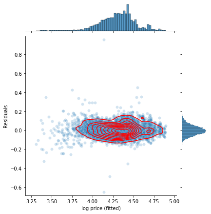
It indeed looks much better than for the previous (year, mileage) two-feature model, with close to normal distributions in both the residuals and the fitted log price values.
Lasso and Ridge
The training and test scores of the fitted linear model are not very different, which indicates that the model is not overfitting much. This is also expectable for linear models, since these models tend to have large bias, but low variance.
To make sure that the data has not been overfitted, I performed lasso and ridge regressions, for a series of values of their alpha parameters.
from sklearn.model_selection import GridSearchCV
from sklearn.linear_model import Lasso, Ridge


def run_gridsearchcv(model, data, values):
    param_grid = {"regressor__alpha": values}
    clf = GridSearchCV(estimator=model, param_grid=param_grid, return_train_score=True)
    X, y = split_dependent(data, dependent="log price")
    clf.fit(X, y)
    print_cols = [
        "param_regressor__alpha",
        "mean_test_score",
        "mean_train_score",
        "std_test_score",
        "std_train_score",
    ]
    display(
        pd.DataFrame(clf.cv_results_)[print_cols].set_index("param_regressor__alpha")
    )


lasso = Pipeline((("one_hot", make_cat_ohe()), ("regressor", Lasso())))
run_gridsearchcv(lasso, bmw_reduced, [0.0005, 0.001, 0.01, 0.1])
| param_regressor__alpha | mean_test_score | mean_train_score | std_test_score | std_train_score |
|---|---|---|---|---|
| 0.0005 | 0.877208 | 0.904545 | 0.0223621 | 0.00610624 |
| 0.001 | 0.854278 | 0.885735 | 0.0271995 | 0.00746144 |
| 0.01 | 0.785222 | 0.828832 | 0.0381799 | 0.0157697 |
| 0.1 | 0.435042 | 0.543166 | 0.0743292 | 0.0256998 |
ridge = Pipeline((("one_hot", make_cat_ohe()), ("regressor", Ridge(tol=1e-9))))
run_gridsearchcv(ridge, bmw_reduced, [0] + list(10 ** i for i in range(5)))
| param_regressor__alpha | mean_test_score | mean_train_score | std_test_score | std_train_score |
|---|---|---|---|---|
| 0 | 0.905043 | 0.926557 | 0.0197125 | 0.00465733 |
| 1 | 0.904937 | 0.926467 | 0.0196359 | 0.00466348 |
| 10 | 0.899553 | 0.922216 | 0.0199545 | 0.00495618 |
| 100 | 0.865437 | 0.894768 | 0.0248639 | 0.00734358 |
| 1000 | 0.816256 | 0.854245 | 0.0337162 | 0.0118805 |
| 10000 | 0.6428 | 0.71412 | 0.0553459 | 0.0251552 |
We see that neither lasso nor ridge regression are able to decrease the difference between the test and the training score, which I also expected from the small initial difference between the two. I therefore continue the analysis without any of these regularizers.
Validation check
Finally, I check the model using the validation set.
X, y = split_dependent(bmw_reduced_train, dependent="log price")
linreg.fit(X, y)
X_val, y_val = split_dependent(bmw_reduced_val, dependent="log price")
y_predict_val = linreg.predict(X_val)
r2_score(y_val, y_predict_val)
0.9342421734441906
The obtained validation R^2 score is close to the R^2 from the cross-validation, which once again indicates that the model is not overfitting. I go ahead with this model, refitting it to the full dataset.
X, y = split_dependent(bmw_reduced, dependent="log price")
linreg.fit(X, y)
Pipeline(steps=[('one_hot',
                 ColumnTransformer(remainder='passthrough',
                                   transformers=[('onehotencoder',
                                                  OneHotEncoder(drop='first'),
                                                  <sklearn.compose._column_transformer.make_column_selector object at 0x7f58fb924640>)])),
                ('regressor', LinearRegression())])
Parameter interpretation
A nice property of the linear regression model is that its coefficients has straightforward interpretations. Below I print these coefficients, together with the standard deviation in the corresponding variable.
def prepare_linear_coeffs(features, linreg, std=None):
    coeffs = pd.DataFrame(
        {
            "observable": features,
            "coef": linreg.coef_,
            "10^coef": np.power(10, linreg.coef_),
        }
    )
    coeffs = coeffs.set_index("observable")
    if std is not None:
        coeffs["std"] = std
        coeffs["coef*std"] = coeffs["std"] * coeffs["coef"]
        coeffs = coeffs.sort_values("coef*std", key=np.abs, ascending=False)
    return coeffs


def rename_ohe_features(features, cat_cols):
    for i, cat_col in enumerate(cat_cols):
        features = [
            feature.replace(f"onehotencoder__x{i}", cat_col) for feature in features
        ]
    return features


cat_cols = bmw_reduced.columns[bmw_reduced.dtypes == "category"]

features = linreg.named_steps["one_hot"].get_feature_names()
features = rename_ohe_features(features, cat_cols)

std = pd.get_dummies(bmw_reduced).std()
display(prepare_linear_coeffs(features, linreg.named_steps["regressor"], std))
| observable | coef | 10^coef | std | coef*std |
|---|---|---|---|---|
| year | 0.0438138 | 1.10615 | 2.32526 | 0.101878 |
| mileage | -2.62813e-06 | 0.999994 | 25015.6 | -0.0657442 |
| model_ X5 | 0.245997 | 1.76197 | 0.203453 | 0.0500488 |
| engineSize | 0.0814011 | 1.20615 | 0.529146 | 0.0430731 |
| model_ X3 | 0.156925 | 1.43524 | 0.22422 | 0.0351856 |
| model_ X7 | 0.376932 | 2.38195 | 0.0726057 | 0.0273674 |
| model_ 5 Series | 0.0892217 | 1.22807 | 0.302199 | 0.0269627 |
| model_ X6 | 0.253082 | 1.79094 | 0.100547 | 0.0254465 |
| model_ M4 | 0.223133 | 1.6716 | 0.109086 | 0.0243405 |
| model_ X4 | 0.173732 | 1.49187 | 0.130194 | 0.0226189 |
| model_ 3 Series | 0.0530618 | 1.12996 | 0.417394 | 0.0221477 |
| model_ 8 Series | 0.316008 | 2.07018 | 0.0611868 | 0.0193355 |
| model_ 7 Series | 0.187998 | 1.54169 | 0.100076 | 0.0188141 |
| model_ 4 Series | 0.0612153 | 1.15137 | 0.294422 | 0.0180231 |
| model_ X1 | 0.0651941 | 1.16197 | 0.267339 | 0.0174289 |
| model_ M3 | 0.339084 | 2.18315 | 0.0509401 | 0.0172729 |
| transmission_Manual | -0.0396203 | 0.912809 | 0.418722 | -0.0165899 |
| model_ X2 | 0.0806345 | 1.20402 | 0.164259 | 0.0132449 |
| model_ M5 | 0.244065 | 1.75414 | 0.0527879 | 0.0128837 |
| model_ 6 Series | 0.114494 | 1.30165 | 0.101481 | 0.0116189 |
| model_ Z4 | 0.100097 | 1.25921 | 0.101481 | 0.0101579 |
| model_ M2 | 0.172615 | 1.48804 | 0.0449379 | 0.00775695 |
| transmission_Semi-Auto | 0.00843108 | 1.0196 | 0.497057 | 0.00419073 |
| model_ 2 Series | 0.0116621 | 1.02722 | 0.320129 | 0.00373338 |
I sorted the coefficients by the product of the coefficient and the standard deviation. This product gives a measure of how important the feature is in the model. Since we fit to the logarithm of the price, I also show \(10^{\text{coeff}}\). This can be interpreted as a multiplicative factor, modifying the price depending on the value of the feature. For instance, year has a value of \(10^\text{coef}=1.11\), which means that a car would be 1.11 times more expensive than a corresponding one year older car.
For the categorical variables, such as model, \(10^\text{coef}\) describes the relative price between the different categories. For instance, model_X5 has \(10^\text{coef}=1.76\), meaning that an X5 car is 1.76 times more expensive than the first model, which was dropped by the OneHotEncoder. How many times more expensive one car model is compared to another can be found by dividing their values of \(10^\text{coef}\).
Conclusion
The goal of this project was to make a regression model for predicting the resale prices of BMW cars.
Based on the details of the available data I chose to fit a linear model to the data. Upon performing feature selection, it appeared that the year, mileage and model features influence the price a lot. The engineSize and transmission features had a smaller, but some influence on the price. Finally, the fuelType, mpg and tax features did not seem to have any influence on the price within the linear model, so these features were not included in the final model, which contained the other 5 features.
Comparisons of R^2 train and test scores, as well as lasso and ridge regularizers indicated that the model was not overfitting. The feature selected model has an R^2 score of 0.934 when tested on the validation set, so the model seems to be fairly accurate.
A nice feature of the linear model is the explainability it provides, since the coefficients in the model can be straightforwardly interpreted as giving relations between the different features.
The data had some issues, most notably in the mpg, tax and engineSize variables, which contained some non-sensical or suspicious values. Also, I would have expected that the mpg and tax features should be predictable from the car model and related info, but this did not appear to be the case. These issues should be followed up with the data collection team.
Going forward, it might be possible to achieve better agreement with the data using other, more complicated models, such as random forests or neural networks, but one should be very careful about overfitting, since increased complexity of the model increases the risk of that. Also, in such models it would be more difficult to make clear interpretations of the coefficients, and they thus provide less explainability.
In the appendix below are some considerations for improvements of the linear model and an example of deploying it to a web site. This provides a convenient way for users of the model to make predictions. For demonstration purposes I deployed the model to the cloud application platform Heroku, and an example of a front end to the model at this website . Note that the deployed model sleeps when it hasn’t been used for more than 30 minutes, so it might take around 10 seconds to respond to the first query, although subsequent queries should be faster. Since this is outside the main scope of this report, I deferred the details regarding this to the appendix.
Appendix: deploying the model
In this appendix I will discuss how to deploy this model, and various elements that will make it nicer for an end user to interact with it. The model will be deployed using a flask server that implements a RESTful API, and with a separate html/javascript front end.
Prediction intervals
Only a single number is returned by the linear model above when it is given the data for a car. But we would generally expect that the real prices are distributed with some variance around this value. It would be nice to have some kind of idea as to how big this variance is, that is, how accurate that single number is. One way to indicate this is with a prediction interval.
A prediction interval is an interval of prices, in which we with some percentage (say 90%) of confidence can say that the price of the car would be within. Note that this is different from the confidence interval, which specifies how confidently we can say that we have predicted the mean of the distribution, but the confidence interval says nothing about the variance.
Since prediction intervals do not appear to be included in scikit-learn, I will do my own simple implementation here.
Following https://saattrupdan.github.io/2020-02-26-parametric-prediction/ , the prediction interval is given as
\[\hat{y}_i + \bar{\epsilon} \pm F_{n-1}^{-1}((1-\alpha)/2) s_n(1+\tfrac{1}{n}) \]
where \(\hat{y}_i\) is the fitted value, \(\alpha\) is the fraction of predictions that should fall within the prediction interval, \(F_{n-1}^{-1}((1-\alpha)/2)\) is the PPF of a t-distribution, \(n\) is the number of samples and \(s_n=\tfrac{1}{n-1} \sum_{i=1}^n(\epsilon_i-\bar{\epsilon})^2\). Here \(\epsilon_i = y_i - \hat{y}_i\) is the residual, the difference between the price and the predicted price for a known sample, and \(\bar{\epsilon}\) is the average of the residuals. For large sample sizes, this average should tend to zero.
I implemented this function in the multi_models module as calc_prediction_delta. This function calculates the expression to the right of the \(\pm\) sign in the above equation, i.e. half the width of the prediction interval.
# This requires the multi_models.py file to be present in the same directory as this notebook
from multi_models import calc_prediction_delta, eval_price_with_pred_interval
Calculating this over the BMW dataset gives
dy = calc_prediction_delta(y, linreg.predict(X), alpha=0.90, print_ratio_captured=True)
print("dy", dy)
print("10^dy", 10**dy)
Ratio of values inside prediction interval: 0.92, mean residual: -7.6e-16
dy 0.09199448053781917
10^dy 1.2359317258496598
Here I see that indeed around 90% of the prices were within the 90% prediction interval. Also I see that the mean of the residuals is very close to zero, so I don’t have have to include this mean in calculations of the prediction intervals. From the value of 10^dy, it appears that the 90% prediction interval in this case would go from around 24% below a predicted price, to 24% above.
The function eval_price_with_pred_interval can be used to calculate the price with prediction interval for a given set of features. For instance for the first two values in the dataset this gives
eval_price_with_pred_interval(X[:2], linreg, dy)
| price | lower | upper | |
|---|---|---|---|
| 0 | 11799.9 | 9547.35 | 14583.8 |
| 1 | 25686.3 | 20782.9 | 31746.5 |
To further test these prediction intervals, below I train on various numbers of features to see how the size of the prediction intervals depend on the number of features
feature_cols = [
    "mileage",
    "model",
    "year",
    "engineSize",
    "transmission",
    "fuelType",
    "mpg",
    "tax",
]
linreg_pred_interval = make_ohe_linreg()
all_dys = {}
for i in range(1, len(feature_cols) + 1):
    cols = ["log price"] + feature_cols[:i]
    X_, y_ = split_dependent(bmw_train[cols], dependent="log price")
    linreg_pred_interval.fit(X_, y_)
    dy = calc_prediction_delta(
        y_, linreg_pred_interval.predict(X_), alpha=0.90, print_ratio_captured=True
    )
    all_dys[cols[-1]] = dy
all_dys = pd.Series(all_dys)
all_dys = pd.DataFrame({"dy": all_dys, "10^dy": np.power(10, all_dys)})
all_dys.index.name = "Last added feature"
display(all_dys)
Ratio of values inside prediction interval: 0.90, mean residual: 3.6e-17
Ratio of values inside prediction interval: 0.91, mean residual: 2.8e-16
Ratio of values inside prediction interval: 0.91, mean residual: -6.9e-15
Ratio of values inside prediction interval: 0.91, mean residual: 1.1e-14
Ratio of values inside prediction interval: 0.92, mean residual: -8.2e-15
Ratio of values inside prediction interval: 0.92, mean residual: -2.6e-15
Ratio of values inside prediction interval: 0.92, mean residual: 2.7e-15
Ratio of values inside prediction interval: 0.92, mean residual: 4.8e-15
| Last added feature | dy | 10^dy |
|---|---|---|
| mileage | 0.23089 | 1.70173 |
| model | 0.150666 | 1.41471 |
| year | 0.11494 | 1.30299 |
| engineSize | 0.0968579 | 1.24985 |
| transmission | 0.0932388 | 1.23948 |
| fuelType | 0.0925763 | 1.23759 |
| mpg | 0.0908015 | 1.23254 |
| tax | 0.0907737 | 1.23246 |
I see that for all these different feature models, around 90% of the data actually falls within the 90% prediction interval. Also, I see that as I add more features, the width of the prediction interval shrinks, except adding the last three features doesn’t really change the interval much. This is consistent with my earlier finding that these these last three features do not improve the quality of the linear model.
Making predictions with partial data
A problem with the model constructed in this report from a front end user viewpoint is that all the features have to be specified in order for the model to be able to make a prediction. For a user it would be nice if the model could provide predictions, even if just some of the features are specified.
One way to achieve this kind of behaviour is by fitting separate models for every combination of specified features. This is what the train_set_of_models function imported below does. It takes a list of features, along with the training data. It then returns a dictionary where the keys are tuples for every combination of the features, and the values are dictionaries containing the model and the prediction interval dy. Here I train this set of models on the five features I selected earlier
from multi_models import train_set_of_models, eval_model, dump_models, dump_feature_ranges_to_json_file


included_features = ["mileage", "model", "year", "engineSize", "transmission"]
models = train_set_of_models(included_features, bmw_reduced)
This set of models can be evaluated using the eval_model function, which takes (optionally iterable) keyword arguments and returns a pandas dataframe with the predicted price, and the bounds of a 90% prediction interval. Below I demonstrate this function
eval_model(models, mileage=[20, 400, 500], model=3*[" 2 Series"])
| price | 90% lower bound | 90% upper bound | |
|---|---|---|---|
| 0 | 23666.2 | 16755.8 | 33426.7 |
| 1 | 23543 | 16668.5 | 33252.6 |
| 2 | 23510.7 | 16645.6 | 33207 |
eval_model(models, mileage=5000, model=" 3 Series", transmission="Automatic")
| price | 90% lower bound | 90% upper bound | |
|---|---|---|---|
| 0 | 25811.7 | 18675.3 | 35675.1 |
Dumping models
Here I dump the trained models to a pickle file, which can be read in by the flask app.
dump_models(models)
'bmw_linreg_model.pckl'
The front end needs to know the names, types and ranges of the features, which the following function dumps to a json file.
dump_feature_ranges_to_json_file(bmw_reduced[included_features])
'feature_ranges.json'
Flask server and front end
The model is deployed as a flask app, the source code for which is in the flask_app.py file. See the README.md for how to run this app and use the example front end. I deployed an example of the front to my web page here
.
-
The choice of dropping categories with 20 or less records is somewhat arbitrary, and one could argue for dropping more records. ↩︎
-
For feature selection the adjusted R^2 score, which penalizes adding more features, is often used. In this case, however, the adjusted and plain R^2 score are almost the same, since the number of sample points ~10,000 is much much larger than the number of features ~30. Since the plain R^2 is implemented in scikit-learn, and adjusted R^2 is not, I chose to use the plain one here. ↩︎